Top 10 User Frustrations on the Web
And how to fix (most of) them
What are the most frustrating things that you face on the web today?
In this article, I want to overview my list of the ten most critical frustrations and share practical tips on how to overcome them:
1. Small-sized text
Despite the recent popularity of video format, most information on the web is still in written form. That’s why
Good readability and legibility are essential for good user experience.
Here are a few practical tips for you to follow when working with text:
Font size should be minimum 16px. 16px for body text is a good place to start but remember that the bigger the screen size, the larger the text.
Aim for line-height to be 1.5em or 1.6em for optimal readability.
Always view your designs on an actual device.
2. Tiny click targets
The smaller the interactive elements (links, buttons, and other UI controls), the more mistakes the user will make when interacting with your website.
Do not play ‘hunt a button’ game with your visitors.
](https://cdn-images-1.medium.com/max/2884/1*snzf_RF7_19farK9aWaizg.png) Good vs bad touch targets. Image by Apple
Good vs bad touch targets. Image by Apple
Here are a few good tips:
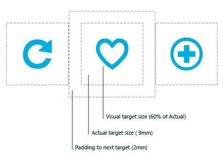
Touch targets should be finger-friendly. The average size of the touch target should be 9mm x 9mm. Material Design states that touch targets should be at least 48 x 48 px.
Add good padding surrounding touch targets. Microsoft guidelines recommend 10mm paddings between touch targets.
 Padding between touch targets. Image by Microsoft
3. Unexpected content shifts
You are about to click on the link. You hover a cursor over the link & click it, and you suddenly realize that you’re doing a wrong thing. Instead of the link you meant to click, you click on the ad. Familiar, right?
Content shift typically happens as a result of dynamically loading content. Since this operation is asynchronous, the dynamic content is plopped into the page and shifts existing content.
](https://cdn-images-1.medium.com/max/2000/1*0aacXjsxIZkANdVZECVLRw.gif) Content shifts on the Verge website. Image by CSS-Tricks
Content shifts on the Verge website. Image by CSS-Tricks
To fix this problem, you can measure the height of the dynamic content and hardcode it as a min-height for the container in the CSS. Find more tips on that in the article Content Jumping (and How To Avoid It).
4. Data loss on errors
You spend 10 minutes filling data in a web form and finally click the ‘Submit’ button. The web page reloads, and you see the same web form but without your data. The only new thing on this page is a message colored in red that says “Error.” Your level of frustration maximizes.
One of the most important rules of interactive design is simple:
User data is sacred.
Always prevent data loss. Use localStorage andsessionStorageto store key-value pairs and pre-fill the data that the user already provided into relevant fields even when the user accidentally click refreshes the page.
window.onload = function() {

    var var1 = localStorage.getItem(var1);
    if (var1 !== null) document.getElemenyById("var1").value = var1;

}
5. Not working “Back” button
User control and freedom is one of Jakob Nielsen’s 10 usability heuristic of user interface design. It says:
Users need a clearly marked “emergency exit” to leave the unwanted action without having to go through an extended process.
And the Back button in a browser is this emergency exit. If you are afraid that users will lose their data by clicking the Back button, it’s better to warn users about that by displaying a message “Your work will be lost"on the Back button click.
window.addEventListener("beforeunload", function(event) { ... });

window.onbeforeunload = function(event) {

// notify about potential data loss here

 };
6. Scroll hijacking
Scroll hijacking is when web designers manipulate the scrollbar to behave differently on their website. Typically scroll hijacking help to show specific animated effects. But
Crisp illustrations and fine animations do not always make a great web experience.
When you use scroll hijacking, you take control from site visitors, and this hurts usability. No matter how fast users will scroll, the content will seem to live its own life.
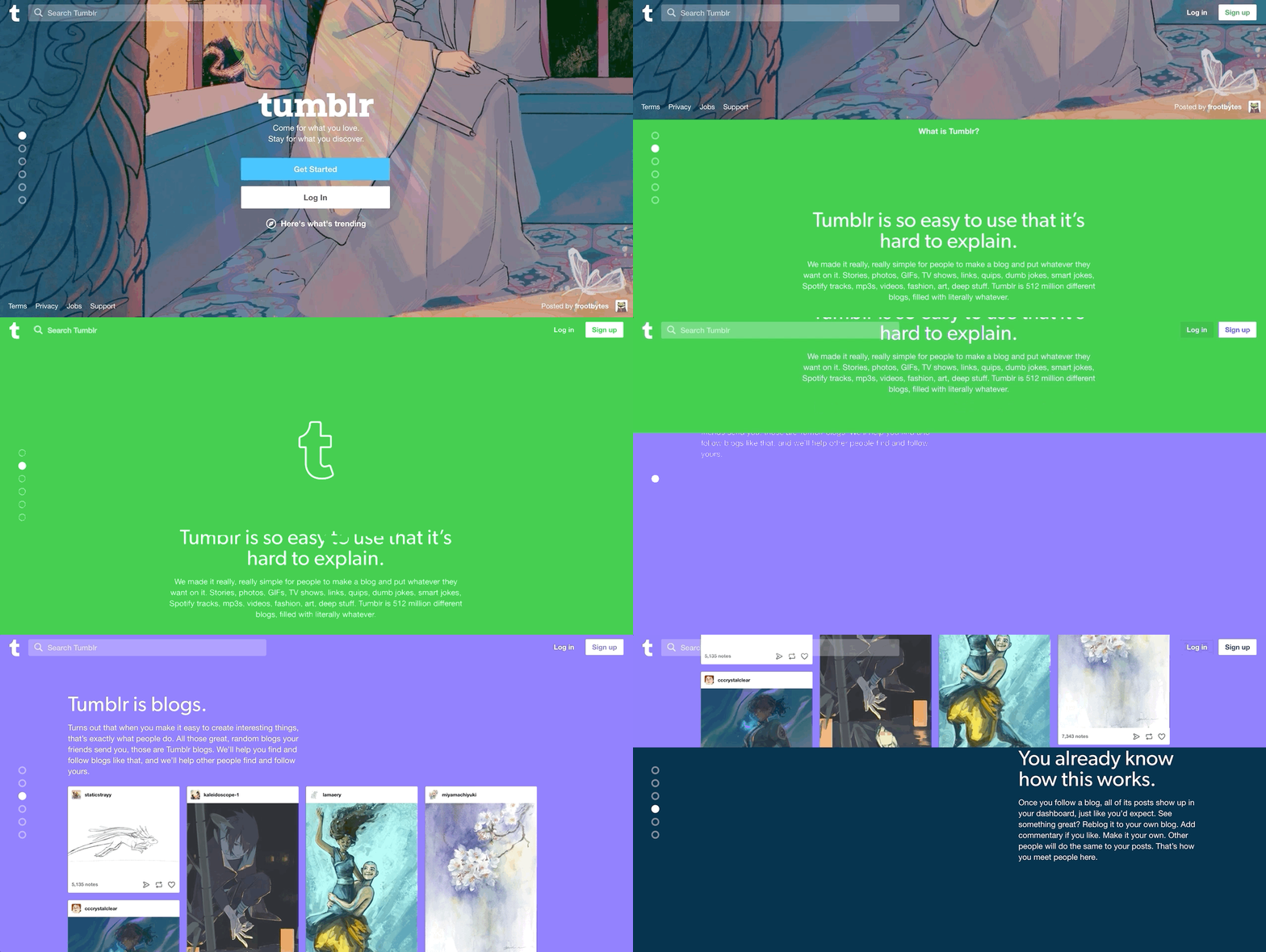
If you still want to use scroll hijacking, at least use a proper layout. Tumblr found a very nice balanced approach — even though the service uses scroll hijacking on the home page, the content on this page is designed in the form of individual slides and users feel like they are switching the slides as they scroll.
 Tumblr’s scroll hijacking.
7. Sign up walls
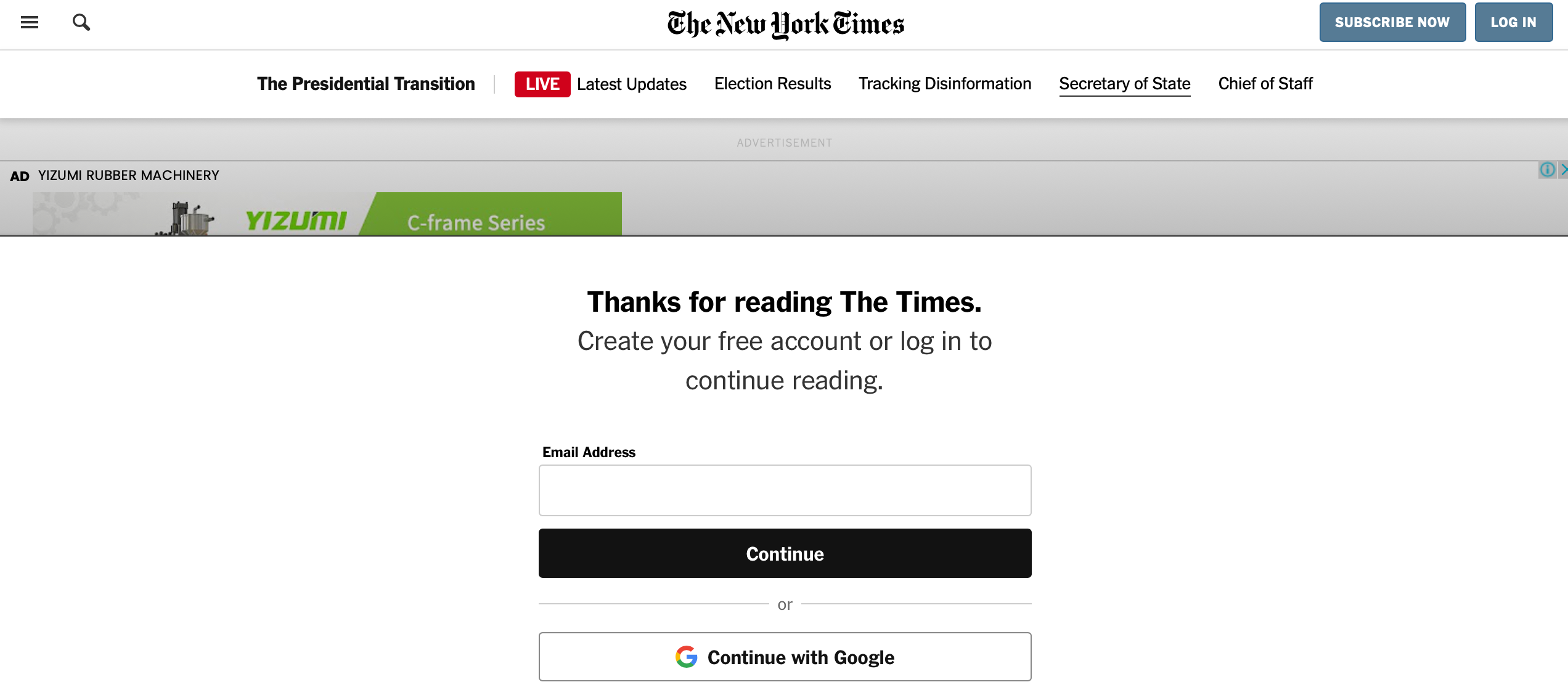
Sign up walls is a mandatory request to create an account to use a service. Sign up walls prevent users from exploring the service.
 The New York Times asks uses to sign up to continue reading.
All software, including websites, should be designed with a principle
Try before you buy
Users should try something, form their impression, and decide whether they want to use a service. For example, in the context of news websites, it’s possible to offer a limited number of articles that users can read without creating an account and ask them to create an account only when they engaged.
8. Autoplay video with sound
When users arrive at a page, they don’t expect to hear audio content that begins playing without their consent. When websites autoplay videos with sound, many users will leave the website immediately. Those who will stay will have to devote extra effort to figure out how to turn the audio off or pause the video, rather than focusing on their goals.
Its fine to use auto-play videos, but ensure that it’s muted by default. Set the audio to OFF by default with the option to turn it ON.
 Facebook videos are set to autoplay, but no sound will appear unless users interact with the video.
9. Permission to send in-browser push notifications
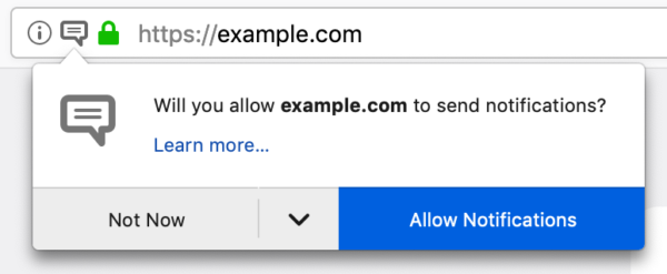
When used properly, push notifications are a great mobile app tool. They notify users with timely and relevant updates. But the same pattern doesn’t work for the majority of websites. When a website requests permission to send notifications, visitors are not interested in this kind of information in most cases. Plus, such requests draw attention to themselves and distract users from interacting with a site’s content.
So if you decide that you still need to send in-browser push notifications, ensure that you have a clear benefit that you can offer to your users.
 Website requests to send notifications. Image by Mozilla
10. Permission to store cookies
GDPR (General Data Protection Regulation) is a legal framework that sets guidelines for collecting and processing personal information from individuals who live in the European Union. It mandates that EU visitors should be given a number of data disclosures. Cookies are the primary tool that store personal details that allow site owners to track your online activity; that’s why GDPR requires cookie compliance.
Some websites show a modal window that asks visitors to accept cookies usage right on the start. They block visitors until they accept the rules or leave a website.
Other websites use a more polite solution — they show an overlay with how cookies are used and give users the freedom of choice whether they want to allow only necessary cookies or all cookies.
 Cookiebot notifies visitors that they collect only necessary data. Image by Cookiebot
If you want to learn more techniques on using cookies, I recommend reading the article Privacy UX: Privacy-Aware Design Framework.
If you enjoyed this article, be sure to follow me here, on twitter, and see you next time! Thanks!