

CSS Tips and Tricks
Calc(), Grid, and Flexbox
Calculate
The first CSS tool we will look at is the calc() function that can be added inside our CSS file. calc() is a function that executes or ‘calculates’ an equation inside it’s parentheses. For this example, we will be looking at a basic HTML document in the browser with three divs inside of a parent div. Let’s say we want to make a child div 1/3 of the entire screens width. Well this would be easy if we know the screen will always be a specific size, but calc() allows us to have our size responsive.
In the browser we can expect the following results:
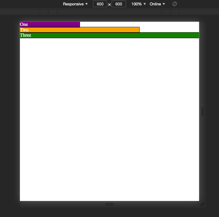 Divs sized using calc
In this example, I set the responsive width and height to 600px so it would be easy to see each div is 1/3, 2/3, and then the full width. However, what if the full width of the screen was 782px or 911px? Instead of approximating with percentages like 33.33% or 66.67%, we can calculate an exact third of our view width to take the guessing and estimation out of our element sizing.
This became a very useful tool for me while working on a project that needed to be styled in a ‘pixel-perfect’ manor. By comparing the size of each div on grid paper provided with the wireframe, I was able to figure out the relationship between the div and the entire screen of the viewing device. So, rather than assign each component a hardcoded height or width, I could assign them values like 1/3rd of the entire screen’s height.
CSS Flexbox
CSS flexbox is a feature of CSS that allows you to style elements on a page in one dimension, either columns or rows, and determine spacing between the elements and the direction they flow. Flexbox is great for a span of elements that needs a consistent display across the board. We can look at the web browser displaying new html and css files, index2.html and styles2.css
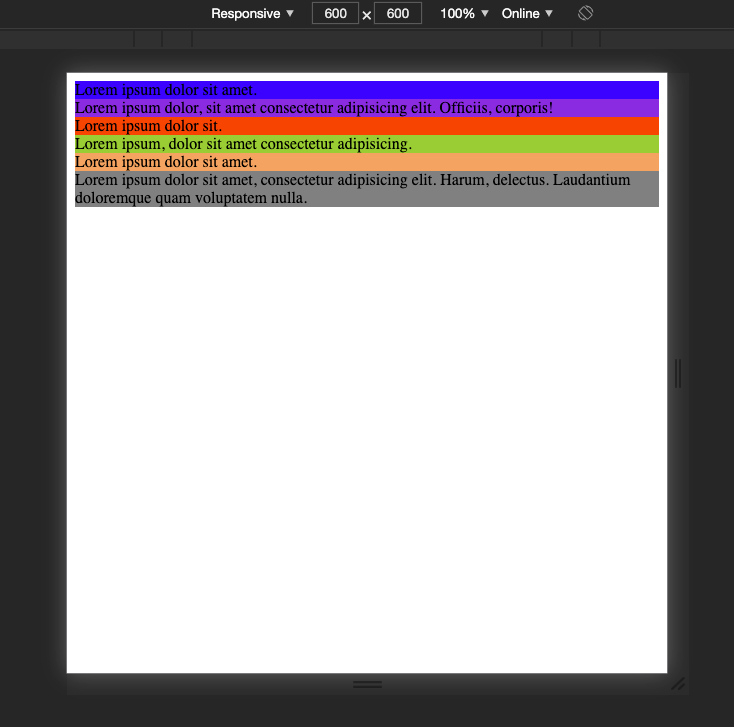 no CSS except colors for each div
The html file for this is as follows:
Now, if we wanted to change the display so that all the divs within the ‘container’ div were on the same line, we can simply set the display of the parent container to ‘flex’, and they will all be fit on the same line, like so:
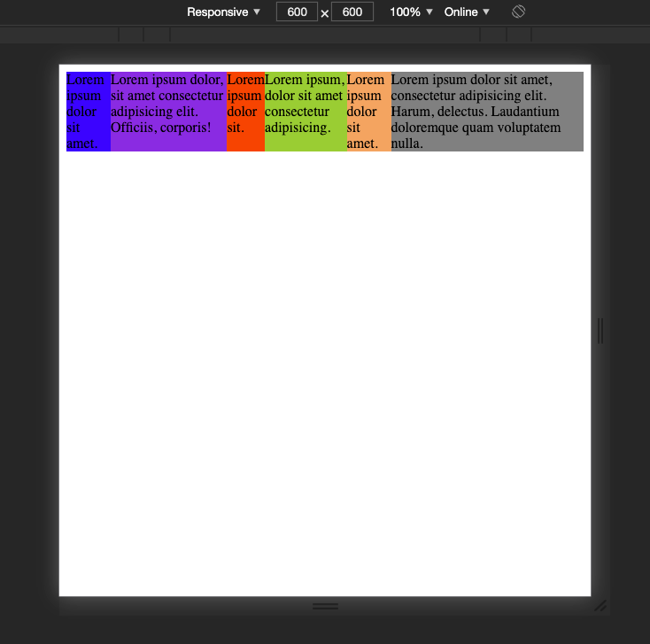 All divs are container to the same line
There are a number of features built in to flexbox that allow us to further alter the placement of content on the page. For example, if we don’t want everything on one line, but we want to keep the text in a row, we can add flex-wrap to our parent container. This along with justify-content: space-evenly continues the pattern of displaying our divs row by row without starting a new row for every div, but also changing the spacing between them. By adding a default size to the divs, we can see just how effective these additions can be:
 space between each element
The last feature of flexbox I will discuss here is the ability to move the content of each child component within itself. With align-self, you can change the space within the flexbox that the div takes up and where it sits.
 align-self example
Looking at the above example, we can see that align-self has put the content of each div either in the center, beginning, or end of the actual div.
CSS flexbox also has many useful features such as align-content, align-items, and flex grow. These all allow you to change the layout and size of the items within the flexbox. At the bottom of this article I have linked the documentation for CSS flexbox, but you can use the above code as a jumping off point. Try to incorporate it into your next project!
As I have been learning more about CSS, it seems that commonly flexbox is used for layouts of specific containers and divs, rather than entire pages. Flex box is great because it can arrange a one dimensional row OR column of your content. But what about when you need to arrange your entire page in two directions? That brings us to CSS Grid.
CSS Grid
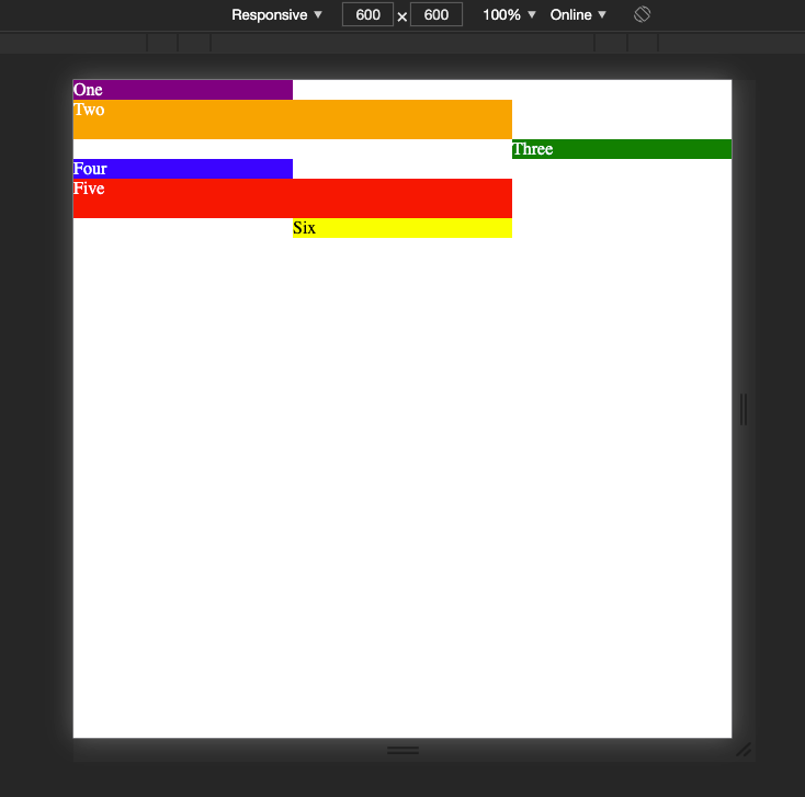
Another astonishing tool for CSS styling is the fairly new CSS Grid. Currently, it is supported by almost all browsers and is considered safe to use for web design. CSS grid differs from flex-box because grid allows for a two dimensional arrangement of elements on the page, where flex-box is dimensional. We can look at our original html but with some different CSS to explore the implementation of CSS grid.
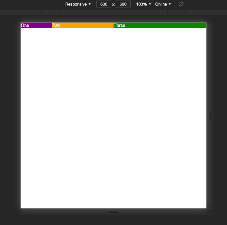 Our divs are aligned by thirds in a single row
As you can see, we have reduced the amount of CSS we have to write to achieve each div’s size. In CSS grid, the unit ‘fr’ is used to reference a fraction of the free space remaining in the grid. The ‘grid-template-columns’ rule sets the value for each column within a grid. This could be a length, percentage, or fraction, in this case it is a fraction. In this example, the first column is 1/5th, the second column is 2/5th, and the third column is 3/5th’s wide. (The fractions are over 5 because if you add all the fr values together, you get 5.
If we wanted to recreate the same display we got using the calc() function to create 1/3rd and 2/3rds, we could comment out our initial grid template columns and add some CSS. However, I am going to add some additional div boxes to demonstrate a few things at once in this next example:
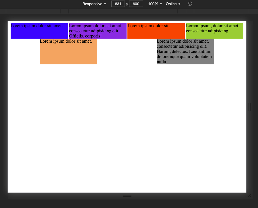
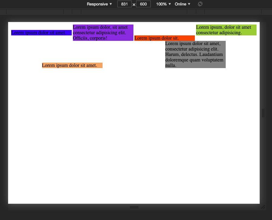
 Screen split into thirds
Let’s break down this a little. In our container, we generate auto columns that represent 1fr of the free space, meaning that the amount of columns will depend on where we position our individual elements, but they will always be an even fraction of the total size. Then, we use the repeat() function to repeat that row sizing of 1fr, 2fr, 1fr every three rows. Even if we had 200 divs in our HTML, the sizing for each row would be 1fr 2fr 1fr, making the middle row twice as large as the first and last in the pattern.
Towards the bottom of the CSS file you can see we set the last div to stay in the center column. Without specifying that it needs to be larger, the div will automatically take up exactly one column in width and one row.
There are dozens of more features I could write about CSS grid, however that will likely become its own blog in the future. I highly recommend reading over the documentation and trying it out yourself to become familiar with it. Building replications of newspapers or card games are some great ways to familiarize yourself with CSS grid. Features like row-gap and column-gap, aligning items and justifying items within their columns and rows, and understanding placement can take your CSS to the next level.
Rapidly Evolving
CSS, as with every other technology, is always growing and changing. Things like flexbox have been around for over 10 years, but is always undergoing updates. CSS grid is fairly new and really solving a lot of problems left over from flexbox. Things like snap scroll, variable fonts, and aspect ratio units are some other great features to utilize with CSS. I can say with confidence, my knowledge of CSS greatly increased from in just a week after having to build a project without any styling frameworks and really dig into the powers of CSS. Also, in my experience so far, many companies looking to hire a front end developer are more interested in your understanding of CSS than what you can do with a styling library. I encourage you to not overlook the basics of web design, and don’t be afraid to stay up to date with the latest CSS trends. Happy Coding!