

Essential Concepts to Build Applications with Awesome UI
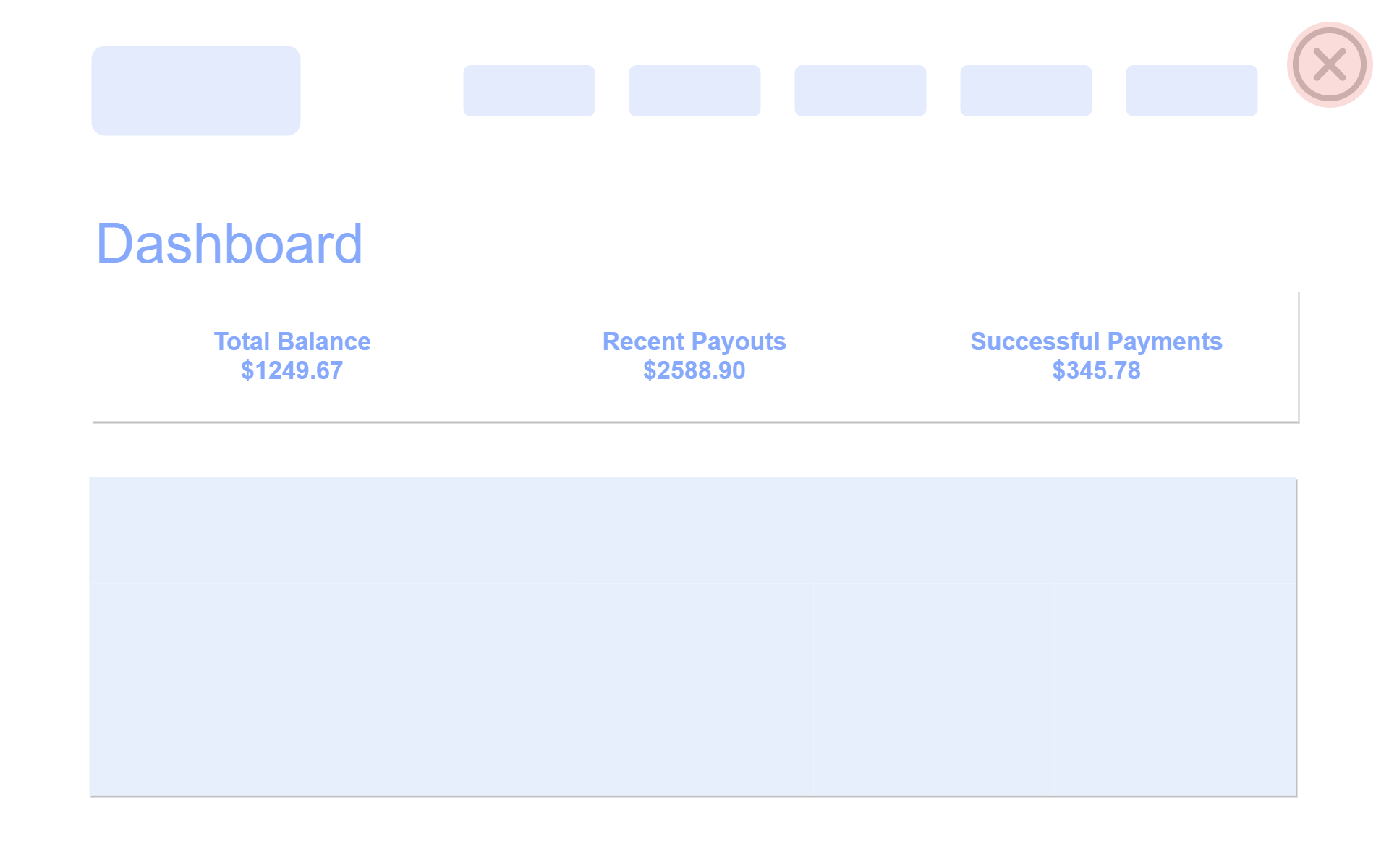
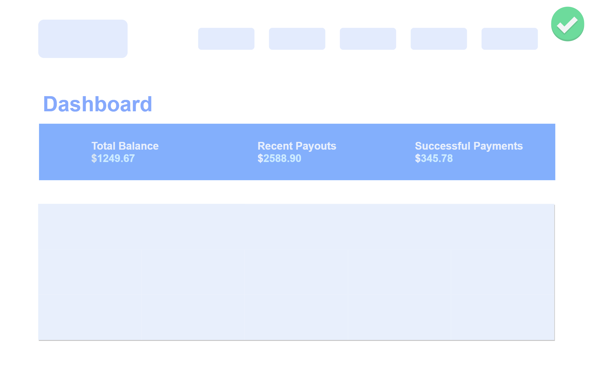
1. Hierarchy is Everything
While developing the front end of your application always make sure that you are sticking to a hierarchy, whether it's the colors, font weight, font style, etc. Having a good visual hierarchy makes your application look less noisy & instead of everything in your interface competing for maximum attention and it’s not clear what matters the most.
For example:
- As you can observe the amount of noise we have in the given below dashboard page, everything looks blended in a single page, and it's not clear where the user should focus at the first visit.
This problem can be easily fixed by using a set of font weights, color hierarchy, and giving border-radius to the most prior elements.
Also, when you build applications with the rule of second and tertiary information it results in more pleasing results without changing too many things.
2. Stop Using Grey Text Everywhere
There are times when we have to use different text colours for primary and secondary labels, and most of the time people end up using a regular grey text as a secondary text label.
The problem with this approach is that using grey is fine with white backgrounds where we are observing grey as reduced contrast of white but the same should be done for other colours.
In order to create a hierarchy of what matters the most in your text, you should only use color with the same hue and adjust the saturation until it matches your needs.
3. Using Labels
Labels are almost everywhere in application, but you might not even need as many labels.
Most of the time front-end developers give the same amount of attention to all the labels, which makes it more time-consuming for users as a piece of data is given equal importance.
Instead of that try giving sorted labels for different parts of your application.
For example:
In an e-commerce application, if your items inventory is shown as raw numbers, your users have to take time to calculate what these numbers are actually about.
Don't do that, if you simply tell your users what these numbers are related to they will be happier.
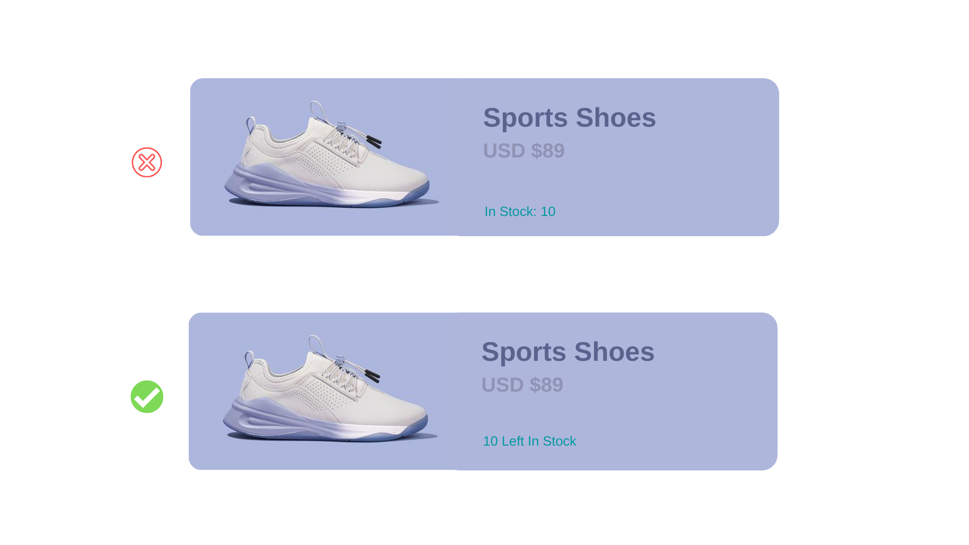 Combined Labels & Values
4. Semantics are Secondary
There are times when we have multiple actions on a single page, in such a situation, it’s easy to fall into the trap of designing those actions according to semantics.
Most of the time people end up ignoring their hierarchy for semantics. Especially while designing buttons semantics plays a vital role as most pages have one true primary action, less important secondary actions, and few tertiary actions.
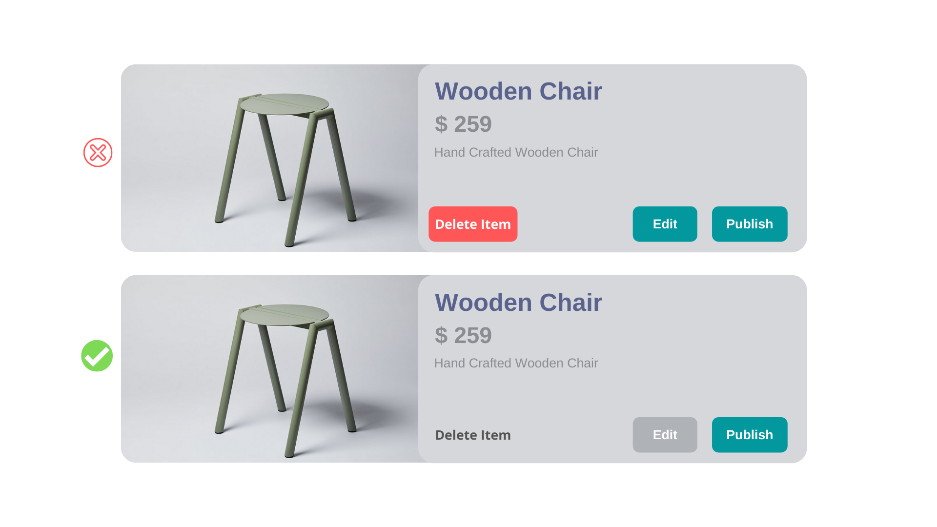
While designing these action buttons make sure of the following points.
Primary actions should be obvious: Use solid and higher contrast background colours.
Secondary actions should be clear: Try not to make them too prominent, outline styles and lower contrast background colours work great in this case.
Tertiary actions shouldn’t be unobtrusive: Style these actions like links works the best.
*Note: Always give hierarchy a priority to design actions on pages, it results in much less noisy UI that communicates more clearly.*
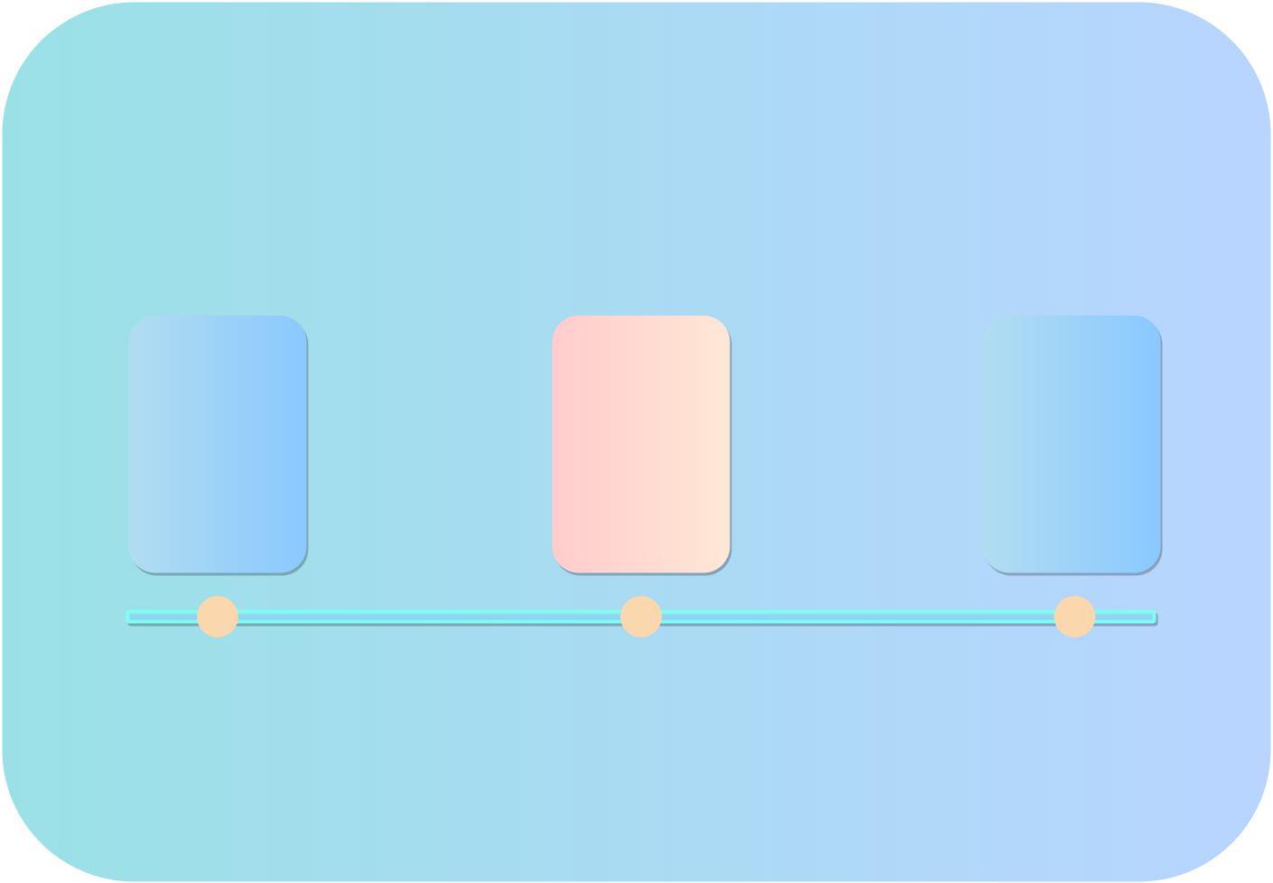
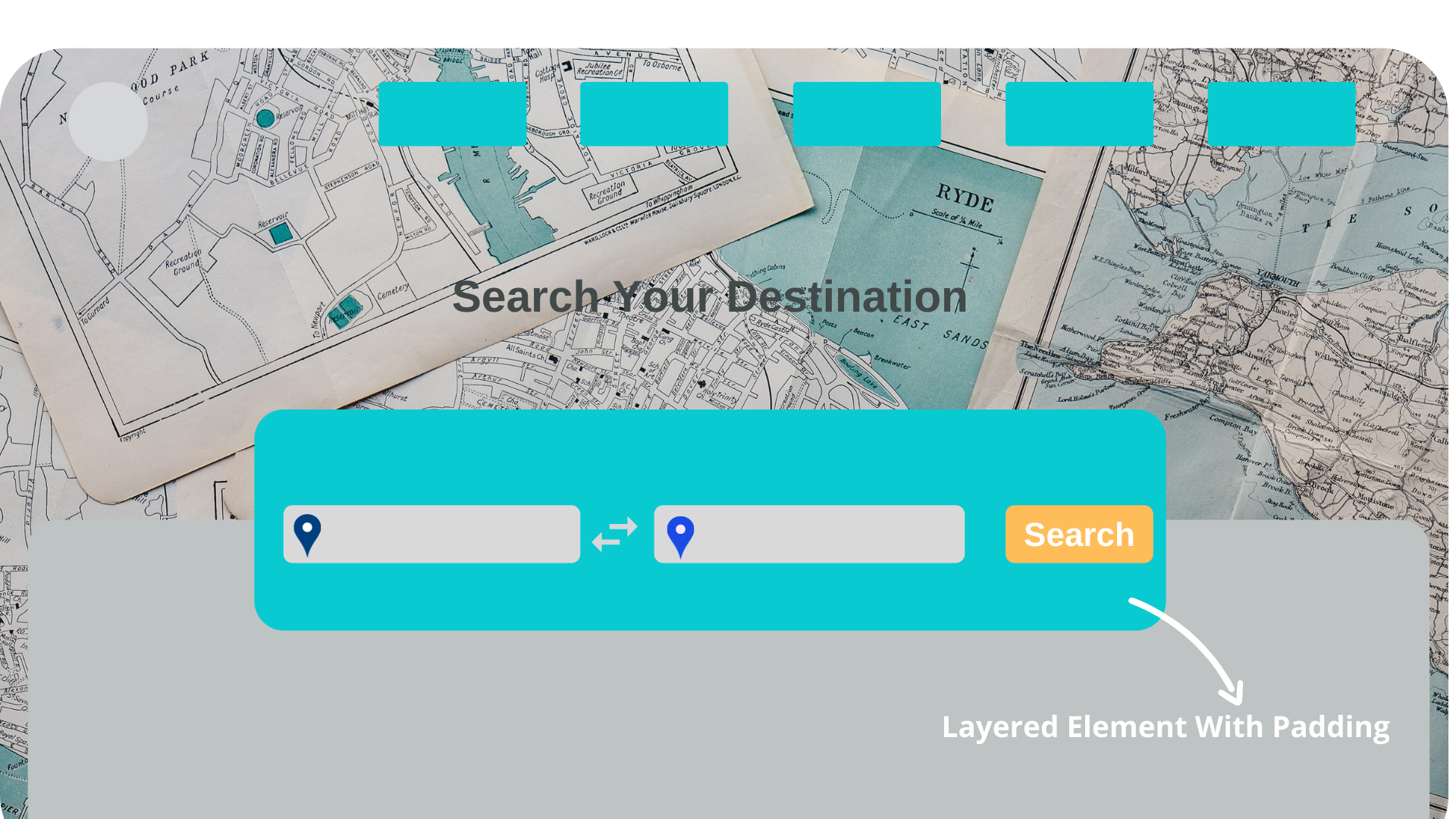
5. Overlapping Elements
A great tip for making web applications smooth for users is overlapping elements, this can be done easily by displaying elements over other elements to make them look more connected to every nearby element.
For example:
- You must have observed this UI trend in many applications these days, where you have elements layer on each other on the first visit of the page.
6. Using Empty Spaces
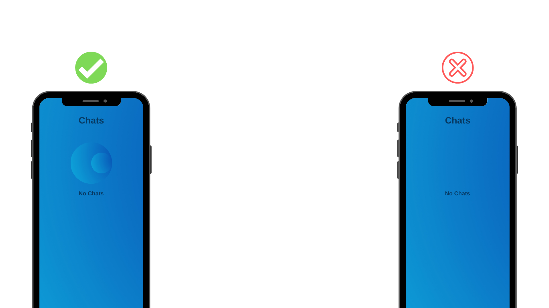
While developing applications, sometimes newly added features don't deliver the actual design & there are multiple reasons for that, one of them is leaving empty spaces.
Don't ignore these empty spaces in your application as the user will go through that at some point and they are most likely to get confused.
Try to add some descriptive icons or images in those empty spaces to make them look more natural with other parts of your application.
If you enjoyed this article, make sure to follow me Orangemn6