6 CSS Properties Nobody Talks About
6 CSS Properties Nobody Is Talking About
Interesting properties that many have never heard of before.
 on [Unsplash](https://unsplash.com?utm_source=medium&utm_medium=referral)](https://cdn-images-1.medium.com/max/10368/0*t8bq2Z1DnTFNumR1)
CSS and HTML have been the cornerstone of the internet for decades.
While HTML was responsible for creating website structures and arranging texts and graphics, it could do little when it came to designing the website.
Designing websites, ever since 1994, has been the sole purpose of CSS. It became the language that described how websites should look and feel.
Over the years, CSS has seen a number of new properties added to it such as Flexbox and Grid.
Despite the immense popularity and rising complexities of creating web apps, there are still a number of CSS properties and tricks that most developers don’t know.
Below are 6 CSS properties that you probably never heard of:
1. all
Have you ever used any CSS framework? If yes, I am pretty sure there might have been times when you wanted to override some of the elements to your liking.
While the most common way of doing that is by using the !important property in CSS to lay emphasis on the current property, ignoring all other settings and rules.
.header{
    color: blue !important;
    font-size: 14px !important;
}
However, writing the same keyword again and again can make the CSS file look messy.
The easier way to do it is to use the all property.
There are 3 property values of all — initial, inherit, and unset.
.header{
  all:initial;
  color: blue;
  font-size: 14px;
}
all:initial sets all the properties of the element to their fallback or initial values.
Chrome and Firefox support this property starting version 37 and version 27 respectively. This property is also supported on Edge browser, but not on Internet Explorer.
2. writing-mode
.](https://cdn-images-1.medium.com/max/2600/1*m5Ut8kRsp8oSIUogG_EMuw.jpeg) Source: httpster.
Source: httpster.
On the right side(near scrollbar) of the image above, you can see texts laid sideways which is a neat way of showing additional information.
The writing-mode property allows you to achieve exactly this.
This property supports the following values:
sideways-rl: Text and other content are laid out vertically from top to bottom and are set sideways toward the right.
sideways-lr: Like sideways-rl, text and other content are laid out vertically from top to bottom but set sideways toward the left.
vertical-rl: Text and other content are laid out vertically from top to bottom and right to left horizontally. If there are two or more lines, the lines are placed to the left of the previous line.
vertical-lr: Unlike vertical-rl , horizontally the text is laid out left to right, and if there are two or more lines, the lines are placed to the right of the previous line.
There is also horizontal-tb which represents the standard way of how texts are displayed.
](https://cdn-images-1.medium.com/max/2000/1*enCsNGgsHPLsCxLnu0-FJA.png) Source: MDN Web Docs
Source: MDN Web Docs
You can find the implementation and code snippets here.
3. background-clip
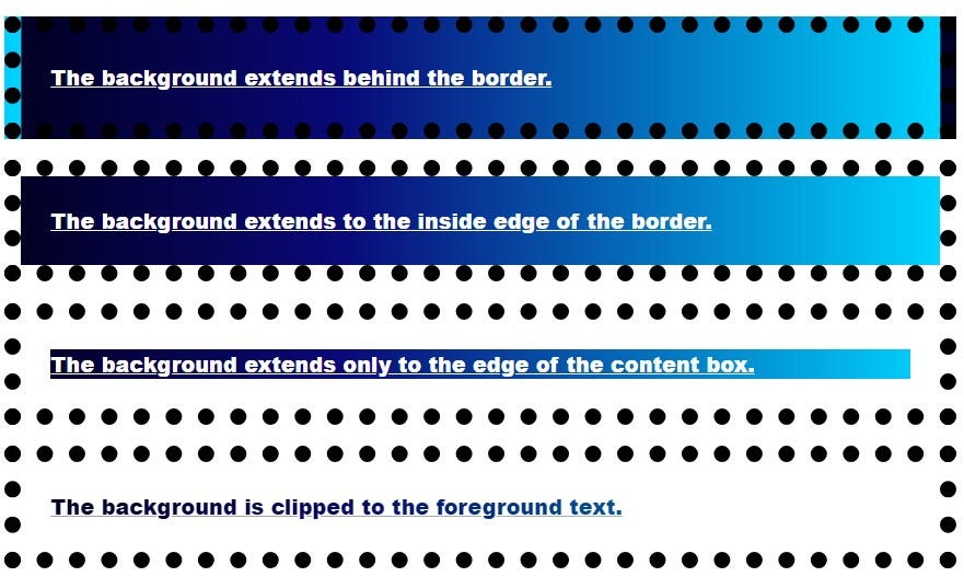
This is an interesting property that allows us to set a custom graphic to our element’s background.
Our custom graphic can extend to the border-box, padding-box, or content-box of the element.
Below is a short implementation of this property:
HTML:-
<p class="border-box">The background extends behind the border.</p>
<p class="padding-box">The background extends to the inside edge of the border.</p>
<p class="content-box">The background extends only to the edge of the content box.</p>
<p class="text">The background is clipped to the foreground text.</p>
CSS:-
p {
  border: .8em darkviolet;
  border-style: dotted double;
  margin: 1em 0;
  padding: 1.4em;
  background: linear-gradient(60deg, red, yellow, red, yellow, red);
  font: 900 1.2em sans-serif;
  text-decoration: underline;
}

.border-box { background-clip: border-box; }
.padding-box { background-clip: padding-box; }
.content-box { background-clip: content-box; }

.text {
  background-clip: text;
  -webkit-background-clip: text;
  color: rgba(0,0,0,.2);
}
Output:
 Source: Author
You can use a custom image and set it as the background of the text as well as shown below:
 Source: Author
It is worth noting that you need to use the -webkit-background-clip property for Chrome and make sure text color is set to transparent.
4. user-select
If you have any text on your website that you don’t want your users to be able to copy, this is the property that will enable you to do so.
The user-select property specifies whether the text of an element can be selected or not.
This does not have any effect on the content loaded except textboxes.
.row-of-icons {
-webkit-user-select: none;  /* Chrome & Safari all */
-moz-user-select: none;     /* Firefox all */
-ms-user-select: none;      /* IE 10+ */
user-select: none;
}
This property can be used to make sure that an entire element got selected as well.
.force-select {
   user-select: all;
  -webkit-user-select: all;  /* Chrome 49+ */
  -moz-user-select: all;     /* Firefox 43+ */

}
You can find the full guide here.
5. white-space
This property is useful when applying text-overflow properties as this property allow you to control the flow of text of an element.
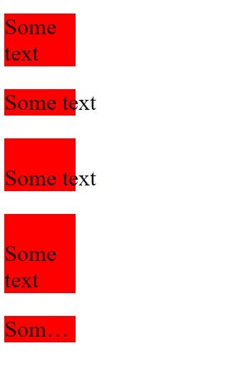
It accepts nowrap, pre, pre-wrap, pre-line and normal as property values.
The nowrap prevents the text from wrapping inside the element width and height and allows it to overflow.
The pre value forces the browser to render the line breaks and white spaces that appear in the code but are stripped out by default. The pre-wrap value does the same except that it also wraps the text in that element.
Thepre-line property will break lines where they break in code, but extra white space will not be rendered.
This becomes clear with the following example:
HTML:
<div>
<p class='zero'>

Some text
</p>

<p class='first'>

Some text
</p>
<p class='second'>
Some text
</p>
<p class='third'>
Some text
</p>
<p class='fourth'>
Some text
</p>
</div>
CSS:
div{
  width:100px;
}
p{
  background:red;
  font-size:2rem;
}
.first{
  white-space:nowrap;
}
.second{
  white-space:pre;
}
.third{
  white-space:pre-line;
}
.fourth{
  white-space:nowrap;
  text-overflow:ellipsis;
  overflow:hidden;
}
Output:
 Source: Author
- border-image property
This property is excellent for designing your website.
You can create beautiful borders around your element using this property.
border-image allows you to set custom images as borders.
I am going to use this image to demonstrate this property.
](https://cdn-images-1.medium.com/max/2000/1*7SOVwmouXHD1lxWGVeSEMw.png) Source: MDN site.
Source: MDN site.
HTML and CSS are given below:
<body>
   <h1>This is a title</h1>
</body>

<!-- CSS below -->

h1{
  border: 10px solid transparent;
  padding: 15px;
  border-image: url(border.png) 20% round;
}
Output:
 Source: Author
This property can be used to create fancy cards or to lay emphasis on certain portions of text.
Final thoughts
Front-end developers use CSS and HTML all the time besides JavaScript and knowing more about these can help one build better apps quicker, faster, and in a better manner.
While I have shared a handful of less-talked about CSS properties, there are more such properties.
Even though CSS has been here for over 2 decades, it still has a lot of properties and tricks up its sleeve.
Knowing these can facilitate the development of fascinating CSS art and websites.
Thanks for reading!